Reports
The fixed report page — completion, throughput, burndown, team performance and the effort figures, for this week, this sprint, this month or all time.
What it is
Reports is the page that answers the questions we chose for you: how much work exists, how much of it is done, what is late, who is carrying it, and whether the pace this period beats the last one. Every figure is counted in the database over the whole workspace, not over the tasks that happen to be loaded on screen, so the numbers hold for a company with six thousand tasks as well as for one with sixty.
How to get there
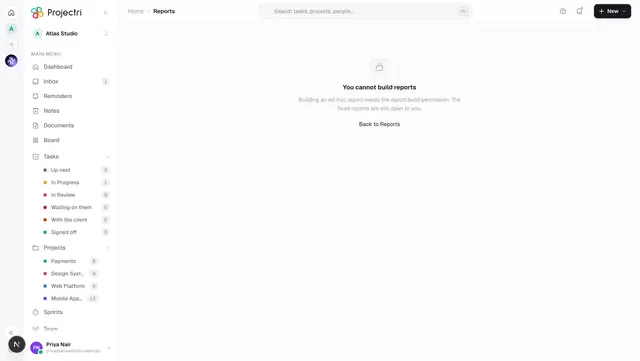
Reports is in the main navigation. The whole page needs the report.view permission — without it the row does not appear and the underlying request is refused. report.view is a granted key rather than something every member holds by default, so a new member may need an administrator to turn it on. There is no plan gate on this page.
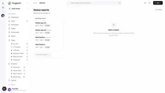
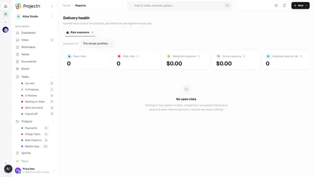
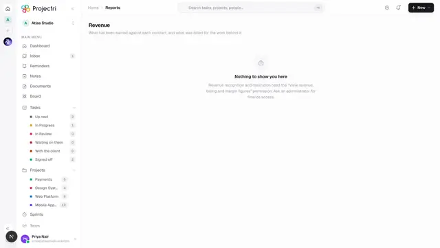
Five more rows sit with it in the navigation, each its own screen: Report builder, Status reports, Scheduled delivery, Delivery health and Revenue.
How to use it
Change the period
- Use the segmented control at the top right — This Week, This Sprint, This Month, All Time.
- The subtitle under the title states which window is being counted and when the figures were generated.
- Switching period abandons the request already in flight, so changing your mind is never a wait. The body shows its skeleton on every load rather than leaving the previous period's numbers under a freshly-pressed tab.
This Sprint follows a cycle, not a fixed number of days. It picks the active cycle covering today; if none covers today it uses the most recently started active cycle, preferring one that actually has tasks attached. The subtitle then names the cycle and its project.
Read the headline figures
The six cards across the top are Total Tasks, Completed, In Progress, Overdue, Velocity and Sprint Health — the last being ticked checklist items over the total. Each carries a sparkline of its own recent history.
Under them sits the effort strip — productivity, efficiency and delay — and each tile prints its own coverage, because a figure computed from four of two hundred tasks is not the team's number. Below that, a panel of predictive insights that renders nothing at all when there is nothing worth saying.
Read the charts
- Completion — the gauge is the completion rate, with done and remaining beside it.
- Completion Trend — daily completions over the last fourteen days.
- Weekly Throughput — tasks completed per week.
- Status Distribution — a donut plus a legend, labelled with your workspace's own stage names.
- Priority Breakdown — Urgent, High, Medium and Low as counts and bars.
- Sprint Burndown — ideal against actual for the cycle named above the chart.
- Team Performance — one card per person with active, done and total.
- Attention Required — overdue and due-soon tasks with their assignees.
- Top Tags and Recent Activity — the labels in use, and the last few things anyone did.
- Insights — four written sentences covering velocity against the previous period, overdue work, workload balance and the highest completer.
Build a report this page does not have
- Press Build your own in the header.
- That opens the report builder, where you choose the data, the groupings and the measures yourself.
What it affects
Nothing on this page writes anything — it is a read of other people's work. What is worth knowing is what changes the numbers.
- Stage names come from your workspace. The status legend and the "moved to…" lines in the activity feed quote your own stage labels, so renaming a stage in workflow settings renames it here.
- Cycles decide the sprint. The sprint window and the burndown both follow the active cycle, so starting, ending or re-dating a cycle moves both. A cycle with no tasks loses to one that has them.
- The activity feed is the one the rest of the product writes to. Creating, completing, commenting, reassigning, moving, reprioritising, logging time, ticking a subtask and attaching a file all appear here.
- Cancelled counts as done. The status mapping folds
CANCELLEDinto done, the same way the task list does, so the two views cannot disagree. - The effort strip is permission-shaped. Without
report.utilizationit shows your own time only and says so in its assumptions. Money figures inside it are removed for readers withoutreport.financial, and cost figures for those withoutreport.cost— removed, not zeroed, so nothing sums a blank into a total.
On mobile
The Reports screen in the app draws the same data as a single scrolling stack: headline numbers first, then the throughput trend, the status mix, and the people and risk cuts. Four side-by-side charts would be four illegible thumbnails at phone width, so they are full width and stacked in priority order. The period chips on the phone are This week, This month and Quarter.
Limits and gotchas
- Velocity has no comparison in a fresh workspace. With no comparable previous period the insight card states the count and says there was nothing to measure against, rather than inventing a percentage.
- A sprint is not a finance period. The effort strip has no notion of a sprint, because a sprint belongs to one project and those figures are company-wide, so a sprint reads the month and "All Time" reads the year.
- The predictive panel being empty is not a failure. It renders only findings someone could act on today.
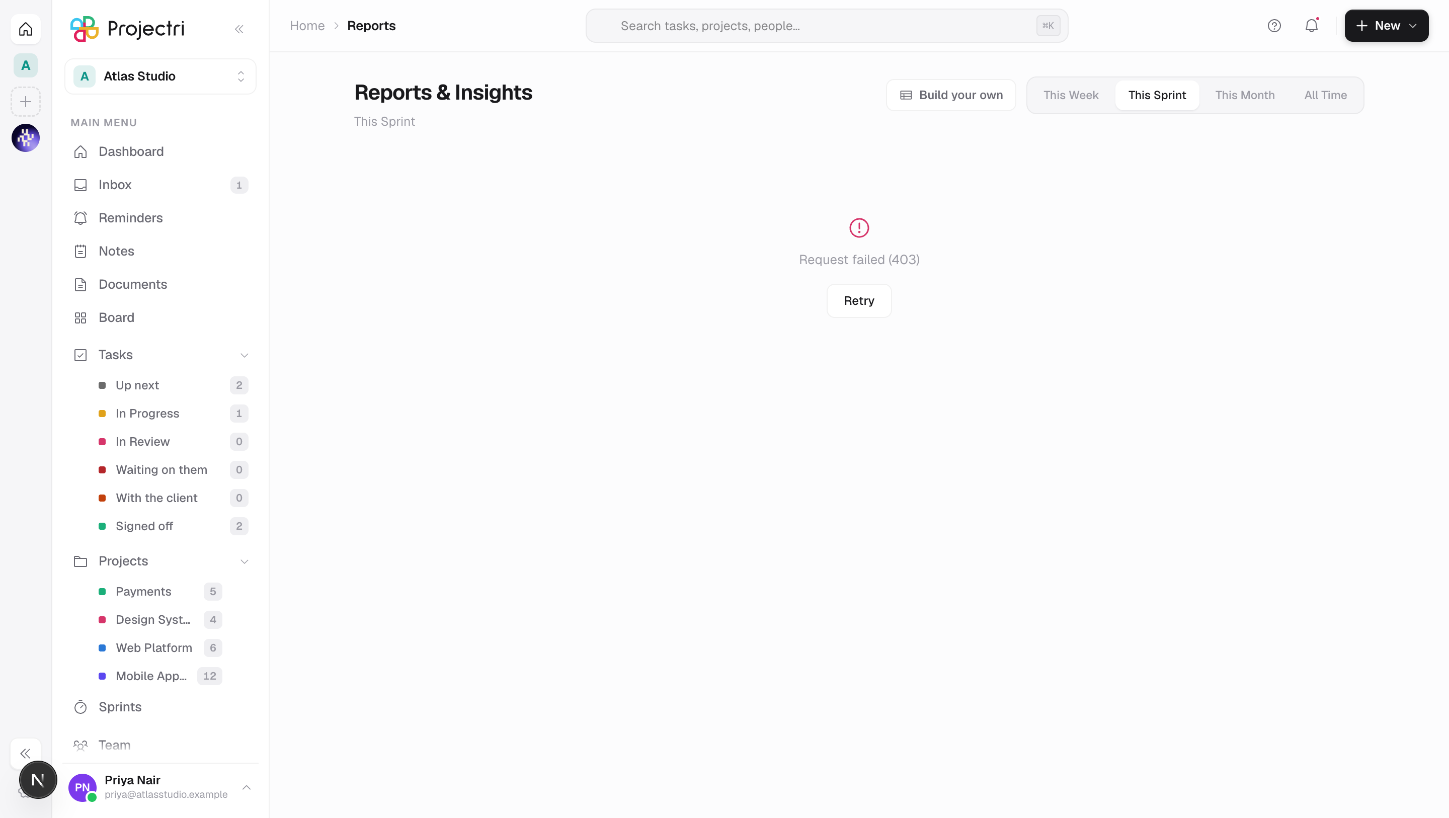
- A failed load is a state, not a blank page. The header stays and a Retry button appears under the error.
Related
- Report builder — for when the question you have is not one of these.
- Delivery health — earned value and risk exposure across the portfolio.
- Status reports — the client-facing write-up of a project.
- Dashboards — assembling your own tiles rather than reading ours.