Delivery health
Earned value across the portfolio — cost and schedule performance per project, the S-curve behind one of them, and what the open risk register would cost.
What it is
Delivery health is the portfolio read before the meeting. It plots every baselined project on cost performance against schedule performance, draws the weekly planned-versus-earned-versus-actual curve behind any one of them, and sums the open risk register into what it would cost if those risks land. The two halves are on one screen because they are the two halves of the same sentence in the same conversation.
How to get there
Delivery health sits under Reports in the main navigation, gated on report.view. There is no plan gate.
Inside, the panes are gated separately, and a pane you may not have is absent rather than leading to a refusal:
- Quadrant and S-curve need
report.view. - Risk exposure needs
risk.view. report.costdecides whether any money is shown at all. Without it the cost figures are missing from the payload rather than blanked.
With neither key the page says so plainly rather than opening empty.
How to use it
Read the quadrant
- The tiles across the top are Measured (projects with a baseline, out of the active portfolio), At risk, Over cost, Behind schedule and, with cost permission, Forecast variance — budget less forecast at completion, where negative is an overrun.
- The plot puts schedule performance on one axis and cost performance on the other, with reference lines at 1.0. The bottom-left corner is the meeting agenda. Axes are clamped between 0.5 and 1.5, so one disastrous project does not rescale the plot until every healthy one sits on the line.
- Below it, one row per project with Complete, Planned, **Against plan in points, SPI and — with cost permission — CPI, Budget**, Spent and Forecast variance, plus a sentence reading the numbers out.
- Each row states which percent-complete method it uses: milestone-weighted by billed value, effort as hours logged against hours estimated, or the project manager's own judgement per task.
- Not measured at the bottom names the projects that have no baseline. They are named rather than dropped — a portfolio screen that silently omits the unbaselined projects omits exactly the ones nobody is managing. When one reason covers the whole list it is said once, and the list becomes names.
Read one project's S-curve
- Press S-curve on a project row, or open the S-curve tab and pick a project.
- The chart is that project's weekly snapshots since it was baselined — Planned value, Earned value and Actual cost.
- Without cost permission it degrades to a single progress line rather than three currency lines flat along zero.
- A project with one week of history has no curve yet; the snapshot runs weekly, so the line appears once there are two. The figures above it are current either way.
- If the percent-complete method changed part-way through the history, the chart says so — a step in the line may be a change of ruler rather than of progress.
Read the risk exposure
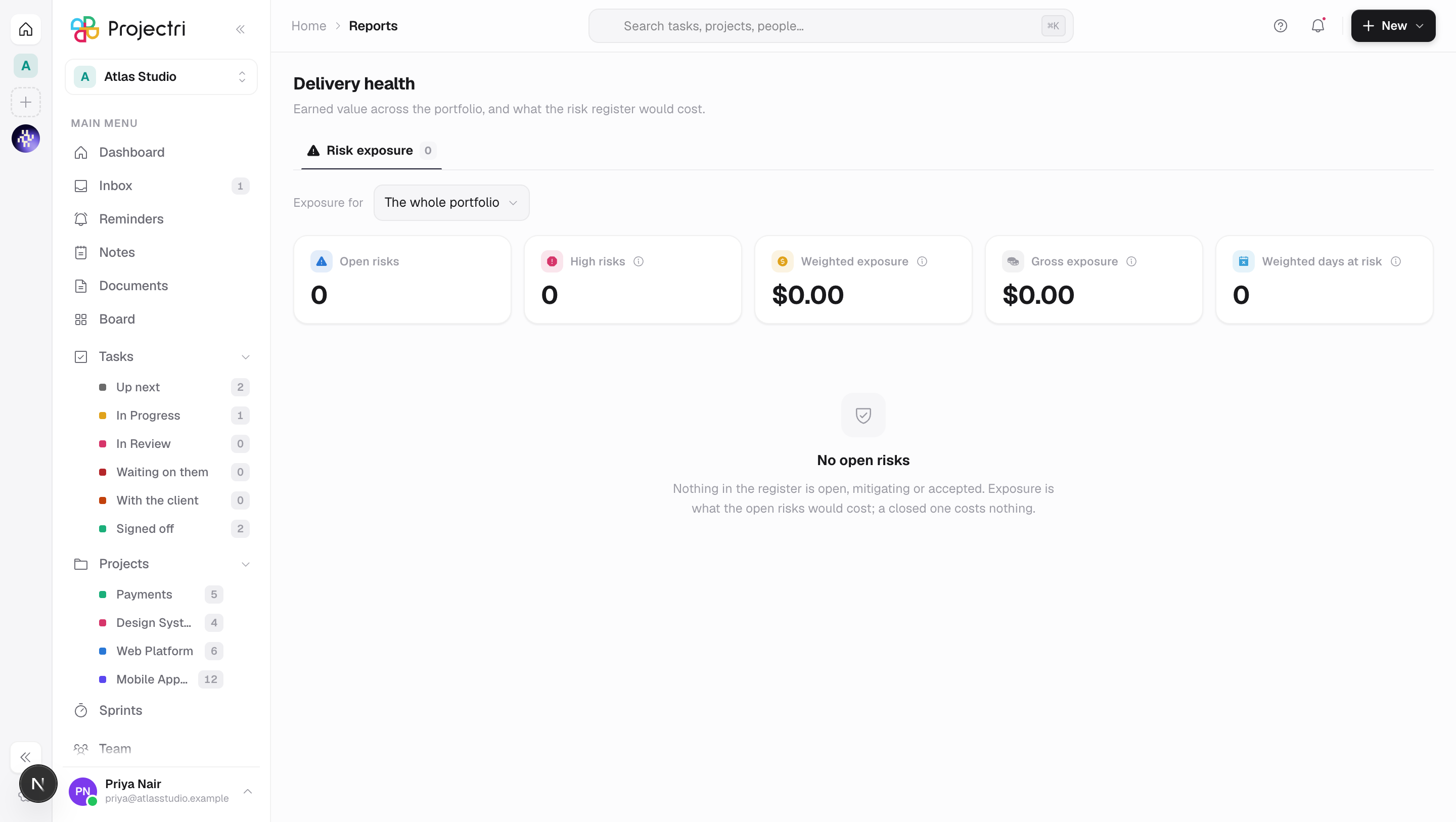
- Open Risk exposure. Scope it to the whole portfolio or to one project.
- The tiles are Gross exposure (what it costs if every open risk lands at once), Weighted exposure (the same weighted by probability — the number to hold a contingency against), Open risks, High risks (probability times impact of 15 or more on the five-by-five matrix) and **Weighted days at risk**.
- Top risks lists the ten highest-scoring open risks with their score, band, weighted cost and a link to the project. The totals above are summed over every open risk, so these ten rows will not add up to them.
- Only risks that are open, mitigating or accepted count. A closed risk costs nothing.
What it affects
- Nothing here is editable. Earned value is computed and a risk register is edited beside the person who raised it.
- A project has to be baselined to appear. Freezing the current plan on a project brings it into the measured set from the next snapshot.
- The snapshot is weekly. The curve is a stored history, so a project's line grows one point a week rather than being recomputed from scratch.
- The quadrant verdict comes from the server, not from the numbers on screen. A reader without cost permission has no CPI, and re-deriving the verdict locally would turn "over cost" into "no data" for the whole portfolio.
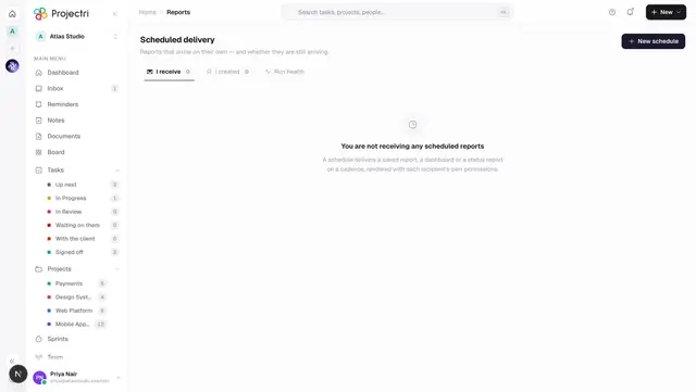
- Delivery performance and Risk exposure are both schedulable. Both appear as built-in reports in scheduled delivery, and a scheduled copy runs the same engine as this screen with the recipient's own permissions.
On mobile
Delivery health in the app has the same three panes, minus the scatter plot — a quadrant needs a plane and gets a ranked list instead. It reads the same payload and applies the same cost rule, so the S-curve degrades to a progress line for a cost-blind reader there too. Nothing on the phone is editable.
Limits and gotchas
- A baseline taken before planned costs were recorded falls back to the project budget as its budget at completion, and the row says so. Re-baseline to cost the plan.
- Money needs a reporting currency. If the risk register carries a cost impact but the workspace has never set a reporting currency, the exposure figure cannot be shown as money. It appears once any invoice, expense or time entry is priced.
- Cost fields are absent, not zero. A reader without
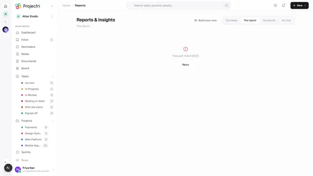
report.costgets rows with the money keys missing, which is why a cost column simply is not there rather than showing dashes. - A failed load says so and offers a retry rather than sitting on its skeleton, which used to make an expired session look like a slow portfolio.
Related
- Reports — the delivery figures without the earned-value frame.
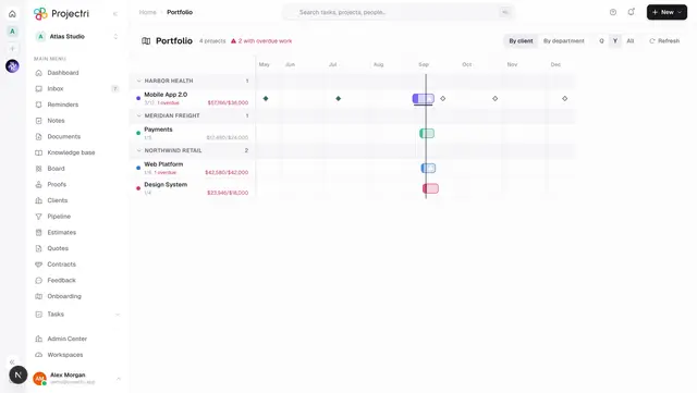
- Portfolio — the projects and clients being measured here.
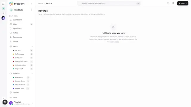
- Revenue — earned against contracted, on the money side.
- Scheduled delivery — having this arrive weekly instead.