Utilization
Logged hours as a percentage of capacity, measured against the target for each person's role, with twelve periods of history behind every name.
What it is
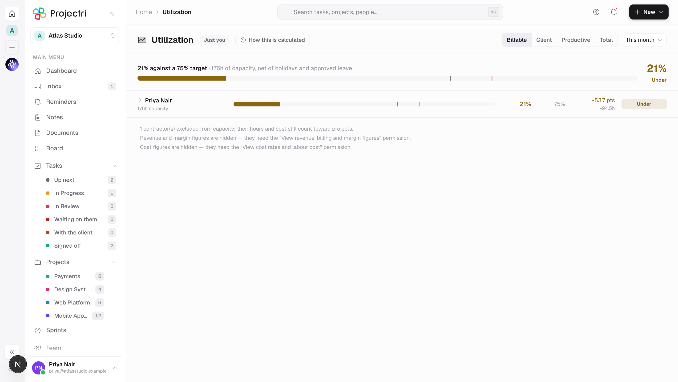
Utilization is hours logged divided by capacity, over a period that has already happened. Every row carries the target that applies to that person, so the number can be read rather than argued about — 73% against a 75% target is a mild miss, against a 60% target it is somebody working too hard.
How to get there
Utilization is in the main navigation, gated on report.utilization.
Scope follows the key rather than a control. Without report.utilization the route hands you your own row instead of refusing — the person who most needs to know they are booked at 140% is the person booked at 140% — and the badge beside the title says Just you or Whole firm so one row never reads as a broken screen.
Two further keys add columns rather than rows. report.financial adds the variance expressed in money; report.cost is the salary-adjacent key used elsewhere in the reporting group. Where a reader does not hold them the column is absent, never blank or zero — a zero would read as the firm having no rate data.
There is no plan gate on this screen.
How to use it
Pick what is being measured
- The four measures across the top decide what the numerator is, and the target is judged against whichever one is selected.
- Billable is billable hours over capacity. Client adds non-billable client work. Productive adds internal strategic work — research, training, documentation. Total is all tracked hours.
- How this is calculated prints those four definitions verbatim, plus how capacity is derived and the order in which a target is resolved.
Change the period and the grouping
- The period menu offers this week, this month, last month, this quarter, year to date and this year.
- Group by rearranges the rows — by person, role, team, department, project or client. It is absent for a reader who may only see themselves, because a team-shaped row containing one person reads as "the team did six hours".
Read a row
- Rows are sorted by distance from target in either direction, so whatever is furthest off is at the top. Sorting by actual descending would put the burnout risks at the top under something that reads like a leaderboard.
- The bar is the actual, drawn against a fixed 0–120% track so two rows can be compared by eye. The dark line across it is the target; the fainter red line is the upper bound.
- Under and over are both amber — both are a miss. Only sustained over the upper bound goes red, because that is the only one of the four states that costs a person rather than a margin point.
- A row whose target came from the published benchmark rather than from your own policy is labelled benchmark default, so a seeded 75% is never mistaken for a number somebody chose.
Open one person's history
- When the table is grouped by person, click a name.
- Twelve periods open underneath, each drawn against the target that was in force at the time — targets are effective-dated exactly so a change on 1 January does not rewrite December.
- A period with no capacity is drawn as a dashed outline, not a zero column. Somebody on parental leave or hired in month seven has no denominator, and a zero-height bar would read as "did nothing".
- The history is only offered on person rows. A role or a client aggregates people, and its twelve-month utilisation is a different report with a different denominator.
What it affects
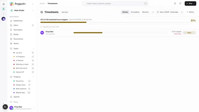
- The confidence figure. The compliance percentage from Timesheets is printed in the totals strip. Where it is below 100% the screen says how many hours across how many people are unlogged, and states that every actual on the page is therefore a floor. Where nothing has been computed at all it shows a dash and a warning, not 100%.
- The burnout strip. People sustained over the upper bound for several weeks running are named above the table, with the number of consecutive weeks and the peak. It is answered per week rather than per period, which is why it is not a column.
- The firm-wide row. Its target is a capacity-weighted blend of the role targets and is labelled as one. It moves when you hire, not when policy changes. No single firm-wide target is ever presented as policy.
- Assumptions. Anything withheld is stated at the foot of the table rather than silently dropped, so a reader knows the margin is restricted rather than unknown.
On mobile
The Expo app has Utilization with the same rules — the same four measures, the same amber-for-both-directions colouring, and the same blend label on the firm-wide row. It is read-only there; setting a target is effective-dated policy that moves everybody's variance at once, and that form stays where the whole table is visible.
Limits and gotchas
- Capacity is contracted hours less public holidays and approved leave, so a week off does not read as a week idle. That divides by the workspace's working days, which are provisioned from the country the workspace was created with. A Gulf tenant left on a Monday–Friday week has a wrong denominator on every row here.
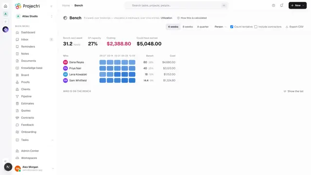
- Utilization is backward, over time entries. Bench is forward, over bookings. They are different measures of the same firm and conflating them is the commonest mistake made with both.
- A target resolves person first, then role and team, then role, then team, then the workspace fallback, and the published benchmark applies only where nothing is configured. Targets are set under Admin → Finance → Targets.
- Changing the measure clears the open history charts rather than relabelling them, so a chart under a row can never be drawn on a different measure from the row itself.
Related
- Timesheets — the compliance figure that qualifies every number here.
- Bench — the same firm measured forward instead of back.
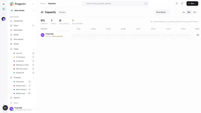
- Capacity — committed hours by week, from task estimates.